Forum Look Updated (in Changelog)
QBPixel Sage
August 6 2008 3:51 AM EDT
Found out Jon was updating the forums when he asked for some help. Enjoy.
Have you checked this in IE? As it is, the user portrait area takes up almost half the width (when window is maximized) and you can no longer look into past threads (there used to be past months at the bottom).
I, for one, would like the text and the pics shrunk, so that I can see more posts per page. And yes, I know I can do the whole Ctrl-minus thing, but that shrinks the left frame too ...
blackshadowshade
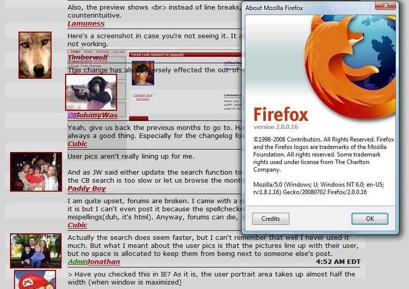
Also, the preview shows <br> instead of line breaks, which is somewhat counterintuitive.
Here's a screenshot in case you're not seeing it. It also appears the HTML preview is not working.

Timberwolf
August 6 2008 4:09 AM EDT
This change has also adversely effected the out-of-ba page.
QBJohnnywas
August 6 2008 4:11 AM EDT
Yeah, give us back the previous months to go to. Having to rely on the search isn't always a good thing. Especially for the changelog forum!
Cube
August 6 2008 4:20 AM EDT
User pics aren't really lining up for me.
And as JW said either update the search function to use google or something because the CB search is too slow or let us browse the months again.
Paddy Boy
August 6 2008 4:23 AM EDT
I am quite upset, forums are broken. I came with a screenshot of how messed up lookin it is but I can't even post it because the spellchecker is telling me there's too many mispellings(duh, it's html). Anyway, forums can die, this is the sucktitude.
Cube
August 6 2008 4:24 AM EDT
Actually the search does seem faster, but I can't remember that well I never used it much. But what I meant about the user pics is that the pictures line up with their user, but no space is allocated to keep them from being next to someone else's post.
> Have you checked this in IE? As it is, the user portrait area takes up almost half the width (when window is maximized)
no idea how IE turns "width:100px" into that.
> and you can no longer look into past threads (there used to be past months at the bottom).
working on this.
> User pics aren't really lining up for me.
should be fixed for crappy browsers now.
> the preview shows <br> instead of line breaks
on my list.
It says "Chatmail [user_name $poster_id] about this offer:" in FS/WTB threads.
Although you probably already know that. :)
Looks pretty good, though. Although my widescreen monitor doesn't like it too much. Maximized window = huge empty space to the right.
> It says "Chatmail [user_name $poster_id] about this offer:" in FS/WTB threads.
fixed
Flamey
August 6 2008 5:09 AM EDT
Can we see more in the specific forums? I don't like how we can only see the past 5 or so threads. What's wrong with a list perhaps the size of the Active Threads?
looks good in FF, IE is such a crappy browser.
QBJohnnywas
August 6 2008 5:31 AM EDT
Yeah, I'm on an old IE at work. I'll wait until I get home to comment on formatting etc when I get back to my FF.
QBJohnnywas
August 6 2008 5:33 AM EDT
Jon,
is it intentional that usernames aren't links to their pages?
Flamey
August 6 2008 5:42 AM EDT
Clicking on usernames takes me to their user page.
QBJohnnywas
August 6 2008 5:49 AM EDT
Ok, so it's probably crappy IE that's at fault. None of the usernames in a thread are clickable links for me.
QBJohnnywas
August 6 2008 5:50 AM EDT
And clicking their user pics gives me the old favourite:
"The requested URL cannot be accessed due to a system error on this server. "
VivaPinata
August 6 2008 6:10 AM EDT
And all the tab anywhere ever are greyed out.
I like this new look, despite the bugggies that come with it ;)
This is how it should look:
http://www.carnageblender.com/shared/portrait.tcl?user_id=3399
This is how it is now:
http://www.carnageblender.com/shared/portrait.tcl?user_id=$row(user_id)
Clicking on the user pics.
Conquest
August 6 2008 6:53 AM EDT
The skin is horrific looking, but everything else is nice. I like the easy and functional preview button.
Flamey
August 6 2008 7:41 AM EDT
preview button has never changed..
Conquest
August 6 2008 7:44 AM EDT
It is quite easy to see now though and the actual preview isn't a cluttered mess like before.
I like that JW and Paddy Boy are now sharing a monkey photo.
Yes please fix how all the pics are all jumbled together with some sharing the lines with others
lostling
August 6 2008 8:13 AM EDT
no idea if its already been said...
too lazy to read through... the preview page is kinda screwed
Flamey
August 6 2008 8:48 AM EDT
Chatmailing someone through FS/WTB appears to be broken.
several things about this new forum looks is broken, the pics are not aligning right, and the background is funny etc.
can we have the old forum back?
Mirick
August 6 2008 9:48 AM EDT
I dislike the layout, I find it hard to see who has written what reply, probably due to the dividing line between username and text. I feel the divider should be between posts by different users.
Also, the replies feel jumbled too close together.
Just my two cents.
I like the format with one exception. On IE, the text starts too far to the right for my own personal preference. Would you we be able to start the text a little closer to the picture?
AdminShade
August 6 2008 10:22 AM EDT
Nice change!
QBsutekh137
August 6 2008 10:25 AM EDT
I'm going to say I think it looks great. I am using Firefox 3, and the text is nice, links work, pics look fine to me, and the subtle striping of alternate posts makes it easy to pick our each separate reply...
Though, without all of those things being true, I can see how it would seem like a step backward... And I can confirm that the text being too far right and links not working is an issue in my IE7.
FYI, in Opera, text looks good, but user links are still dead.
In Safari, links work, text looks good, but clicking on images yields server error.
(but yeah, preview is sort of garfed up in all of the browsers...)
Clicking a picture yields a server error in Firefox as well.
VivaPinata
August 6 2008 10:53 AM EDT
I can't create new contest threads either... >_>
QBOddBird
August 6 2008 11:14 AM EDT
It's alright, but I didn't much see anything that needed changing beforehand, so I can't say "wow, wonderful, just what we wanted!"
Previews are still screwy, HTML tags show in the original post as well when replying.
I mean, I hate to sound like a sourpuss. I appreciate the forum look update...just feel like there are other things that I'd rather see changed.
Cube
August 6 2008 11:22 AM EDT
I'm pretty sure firefox 2 isn't a crappy browser, and I still have the issue.
One other thing I noticed is if you select Plain text and preview your post, it'll have break
tags in it.
QBsutekh137
August 6 2008 11:25 AM EDT
OB, this is all part of the theming/CSS/standardization thing. It will affect ALL pages eventually (I would assume there will be no exceptions, otherwise Jonathan has two methodologies to maintain). The main benefits are behind-the-scenes, better maintainability, and Jonathan has made clear that this is his number one priority right now as he ramps things up for Facebook. I can understand folks voicing opinions on this, it just seems weird that as more and more pages get converted to the "new" way, people still remain surprised every time there is a change. We've known about this for months, and we know it will continue until everything is changed.
QBOddBird
August 6 2008 11:30 AM EDT
Yeah, I know it, sut. I guess I just don't understand why ramping up the game for a big release would be more important than fixing the issues within the game that are actually causing many players to leave.
Again, I don't want to sound ungrateful or anything. I appreciate the forum update and theme-ing updates. I just don't get the priority behind it all.
Guess this is one of those 'trust Jon to make it all better' things.
Lord Bob
August 6 2008 11:39 AM EDT
I'm getting the same problems in Firefox 2. The forums are, in some areas, completely unreadable. In particular, text seems to be overlapping images.
QBPixel Sage
August 6 2008 12:11 PM EDT
Jon, found a big coding mistake. You forgot to close off span tags for the names.
Cube
August 6 2008 12:14 PM EDT
Thanks Pixel, it looks very nice now.
QBPixel Sage
August 6 2008 12:23 PM EDT
Don't thank me, I didn't actually do much. Just helped Jon fix up a big of CSS and found things he was doing wrong =P
Doesn't a CSS validator pick up that sort of mistake?
blackshadowshade
Cube
August 6 2008 12:34 PM EDT
I meant thanks for the fix. Of course thanks to Jon for the new look, I like it a lot.
Ragatag
August 6 2008 12:36 PM EDT
can you make player usernames link-able again?
Lord Bob
August 6 2008 12:48 PM EDT
"Thanks Pixel, it looks very nice now."
I still see the same thing.
fixed user links
fixed confirm page
QBOddBird
August 6 2008 1:30 PM EDT
Thanks Jon! Can we also see the formatting for the 'Reply' page fixed, for the original post's format?
QBsutekh137
August 6 2008 1:33 PM EDT
Confirmed that preview and user links work on IE7, Opera, and Safari.
Remaining issues:
User pics: Don't work on anything
Text too far to right: Just in IE7, that I know of.
Firefox 2.0 issues: I don't have FF 2.0, so did not test.
Cube
August 6 2008 1:44 PM EDT
Correction: I forgot that I'm on a computer with Firefox 3.0 now, so that's probably what fixed my problem if Lord Bob is still having that issue.
Firefox 2.0 is a mess. I've refreshed a few times but no luck on getting anything to line up. It appears the names and pics are, in some cases, under the posts. This makes it look like a sig which is all well and good, but then it seemed that Sut said "Nice change" and Shade put 750 words into describing how delightful it all was.
Also, in some cases, reopening the same post multiple times (this one) leads to new text overlaying the previous viewing.
Though, for the record, putting Lord Bob's pic on Oddbird's posts is an improvement!
My pictures are still 3 inches to the left of where the typing starts, looks goofy, supposed to be this way? And then the Post Reply button is under the user images, i would suggest moving it to be under the text, the stuff we are actually looking at while in forum threads.
From the initial look, I can see the alternating background colors (zebra effect) for each post. However, those alternating colors don't match up. User pictures are still not aligning. My guess is that you are using the css float property everywhere. To fix this problem, you could use a break tag <br> and style it with clear:both to clear the floats. BTW, this is from checking on FF3.0 also. Don't blame IE for all the troubles.
ScY
August 6 2008 1:57 PM EDT
-Unable to send CMs through the FS/WTB forum
-Sometimes the pages get condensed like Bast and company demonstrated with screenies
But other than that, a good change =)
I don't know if anyone mentioned it yet, but the CM text is now red =)
ScY
August 6 2008 2:01 PM EDT
Not to be a naysayer, but sometimes the " ## posts hidden. Click here to show all." thing shows in odd places, like in the middle of posts.
QBPixel Sage
August 6 2008 2:09 PM EDT
I'm actually looking at the HTML source code now. And to be honest, the code is a mess and needs TONS of fixing. Though it looks fine in some browsers, I feel this new forum code was released prematurely.
Ouch, everything is messed up on my end and I see no usefull change. My text is aligned to the far right and there is a large gap between pictures and text.
Well, it looks great in FF3.
Perhaps this is Jon's way of saying that other browsers suck, and you should upgrade. :D
Ragatag
August 6 2008 2:21 PM EDT
the forums look great on FF3, it looks pretty bad in IE
QBsutekh137
August 6 2008 2:32 PM EDT
I think between PixelSage and Jonathan, and actually giving them several more hours to work on this, the cross-platform stuff will work better. If it all ends up looking like it does now in FF 3.0, it will be great!
QBsutekh137
August 6 2008 3:14 PM EDT
Confirmed! Pic links work in all browsers I have available to test (everything but FF 2.0, pretty much...)
Thanks, Jonathan!
BadFish
August 6 2008 4:34 PM EDT
Anyone else still experiencing serious problems with forum layout? I'm getting overlapping text, user pics next to other's posts, overall a huge mess. Luckily I don't really care: just in case anyone else is experiencing this problem and does in fact want someone to do something about it :D
SNK3R
August 6 2008 4:36 PM EDT
I was going to make a post about this last night, but since I haven't been up-to-date on things, I thought this was an old change.
Looks great.
Talion
August 6 2008 4:39 PM EDT
Feeds don't seem to be working anymore... I received a notice for this thread, but haven't received any feeds for new FS/WTB threads since then. I was receiving them well before the change.
fixed rendering in FF2 and IE7. Not going to bother checking IE6, nor am I going to waste any time trying to make it happy so don't bother posting problems with that.
> Feeds don't seem to be working anymore
works fine here.
Lord Bob
August 6 2008 5:44 PM EDT
Wow, this is much better.
how will we be able to lookup history?
Like if I click on Changelog, all I can see is this thread. I can't click on previous months.
QBsutekh137
August 6 2008 6:13 PM EDT
Excellent, Jonathan, this looks great!
Very pretty, thanks guys!
Ragatag
August 7 2008 1:39 AM EDT
looks great on IE, thanks guys
QBPixel Sage
August 7 2008 2:29 AM EDT
Oh sweet. This is my first changelog post =).
Anyways, props to Jonathan for doing a grab job on this!
QBJohnnywas
August 7 2008 3:18 AM EDT
AdminJonathan 2:16 AM EDT
"older posts" are back.
Only for the last three months?
Cube
August 7 2008 3:27 AM EDT
JW, there is a show all button, and I assume that it won't produce a Server Error soon.
QBJohnnywas
August 7 2008 3:29 AM EDT
Sorry missed the show all button!
Flamey
August 7 2008 5:07 AM EDT
perhaps link statistics for the individual forum on that actual page? Instead of clicking on Forums -> Forums list -> [post number].
QBsutekh137
August 7 2008 9:17 AM EDT
Still one small issue that someone mentioned previously -- previews and such show fine except for the original post when you respond to it. It still shows things like <br><br> instead of the actual line breaks, etc.
At least that is what it did for me when I responded to the Mikel hitting 6 million score thread...
QBJohnnywas
August 7 2008 9:22 AM EDT
Same for me as old Frisky Sut above.
VivaPinata
August 7 2008 9:33 AM EDT
Attempting to post in my
contest thread only gives me with a Server Error.
The requested URL cannot be accessed due to a system error on this server.
new forum look is huge. I don't like it.
Just thought I'd ask it here.
Were the graphs updated once again???
For some reason they look a boat load better than they did, which was really friggin good. Then again, it might have something to do with me reinstalling Windoes.
This thread is closed to new posts.
However, you are welcome to reference it
from a new thread; link this with the html
<a href="/bboard/q-and-a-fetch-msg.tcl?msg_id=002VfZ&msg_id=002VfZ">Forum Look Updated</a>